Restaurant opening case study — Blossom & Bourbon, San Jose · 2023 → today
A restaurant doesn't open with a sign.
It opens with an identity.
When a new restaurant came to us in 2023, it had a name and a vision — and nothing else. What left our shop was a logotype, a storefront that glows at dusk, and every design file that made them, handed to the owner to keep. This is how a sign company helps build a brand.
Chapter 1 — a name and a bare wall
It started with nothing on the building.
The owner — active for years in this part of San Jose's dining scene — was preparing something the neighborhood didn't have: a proper restaurant and bar, in an area long dominated by chains and drive-throughs. There was a name, Blossom & Bourbon, and a feeling it should carry: soft on one side, strong on the other.
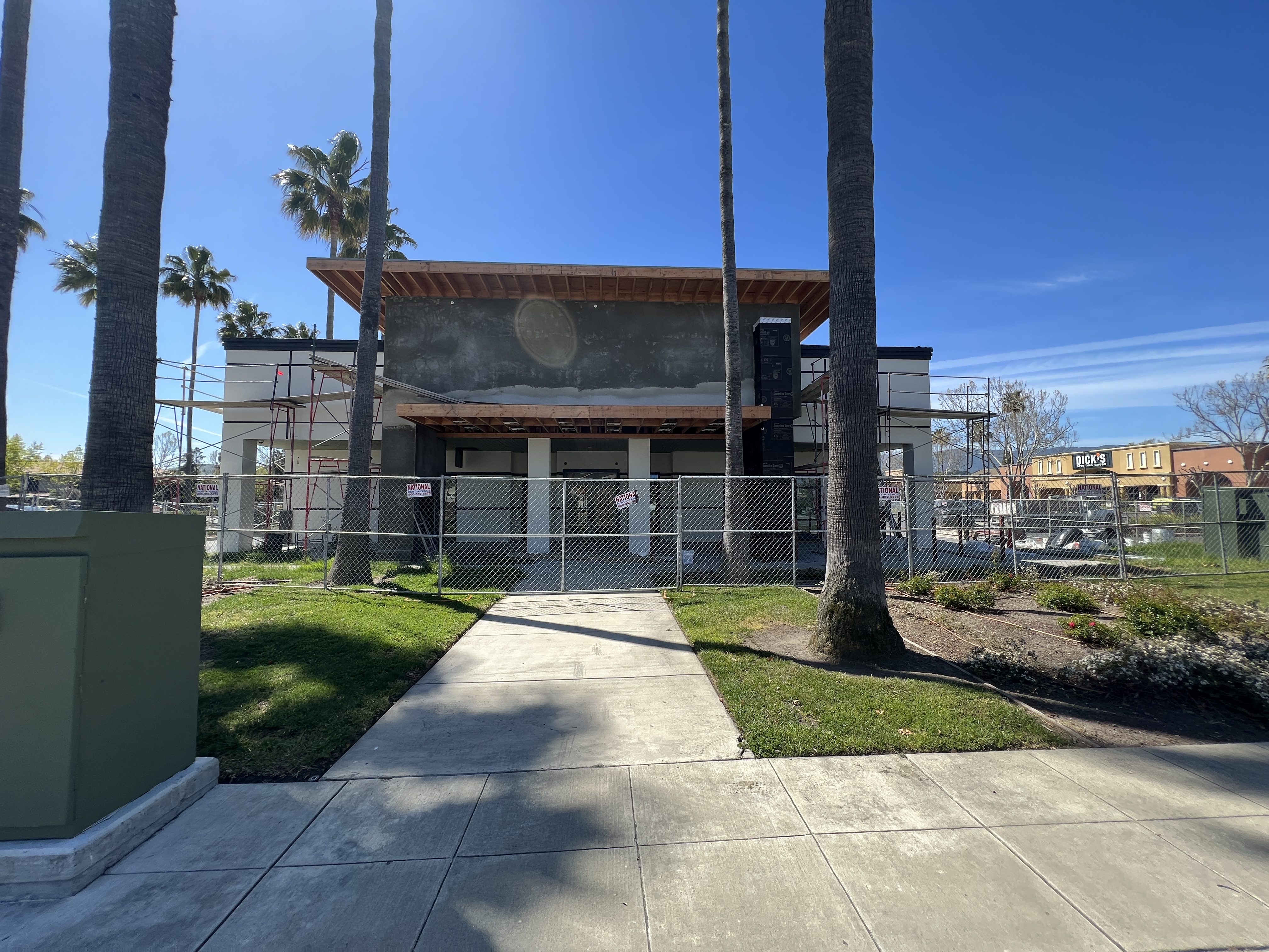
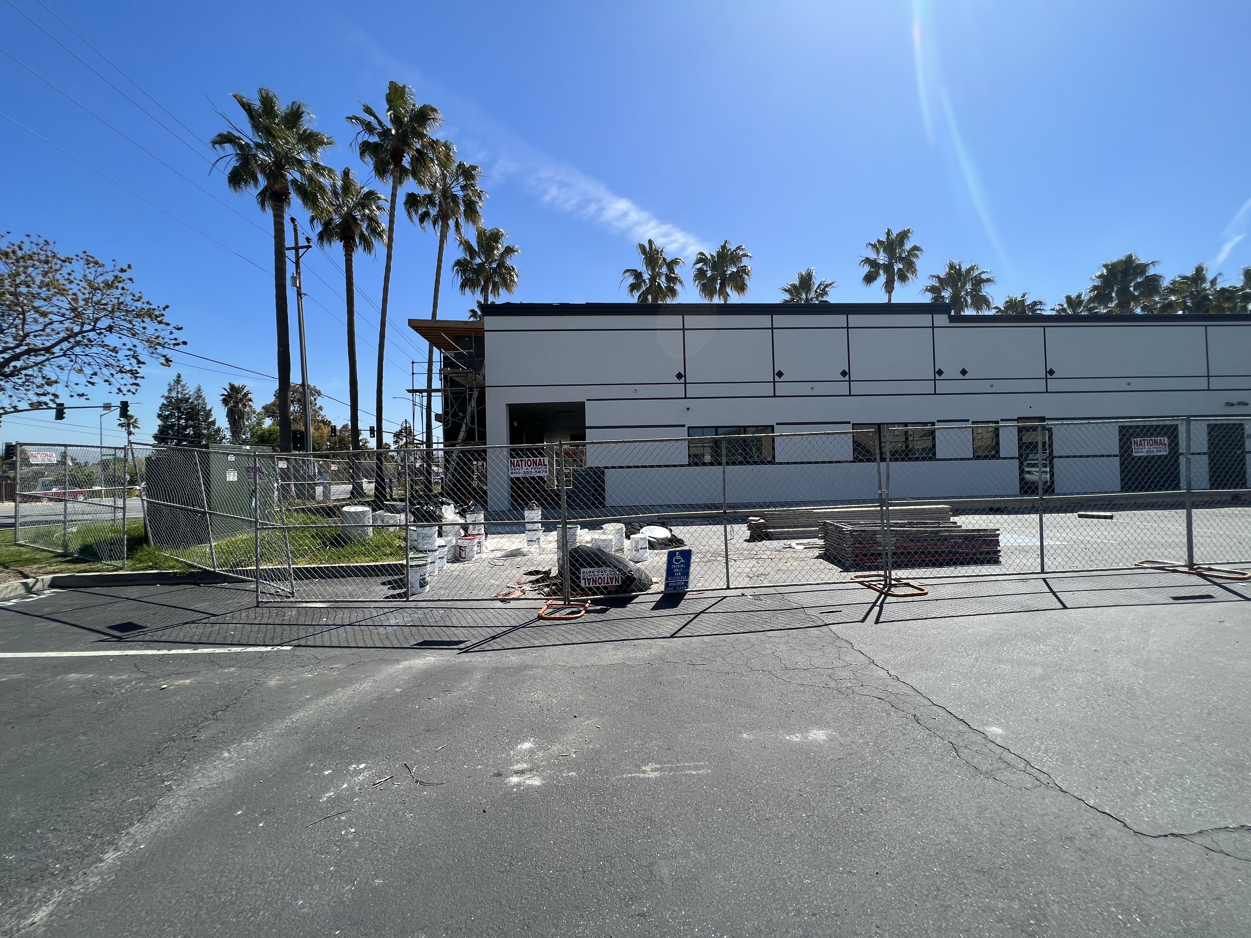
There was no logo. No lettering. No sign package. Just fresh stucco, scaffolding, and a deadline. That's where we started.
2023 — the front, mid-construction
2023 — the side elevation, blank
Chapter 2 — shaping the concept
Most shops pick a font. This lettering was made.
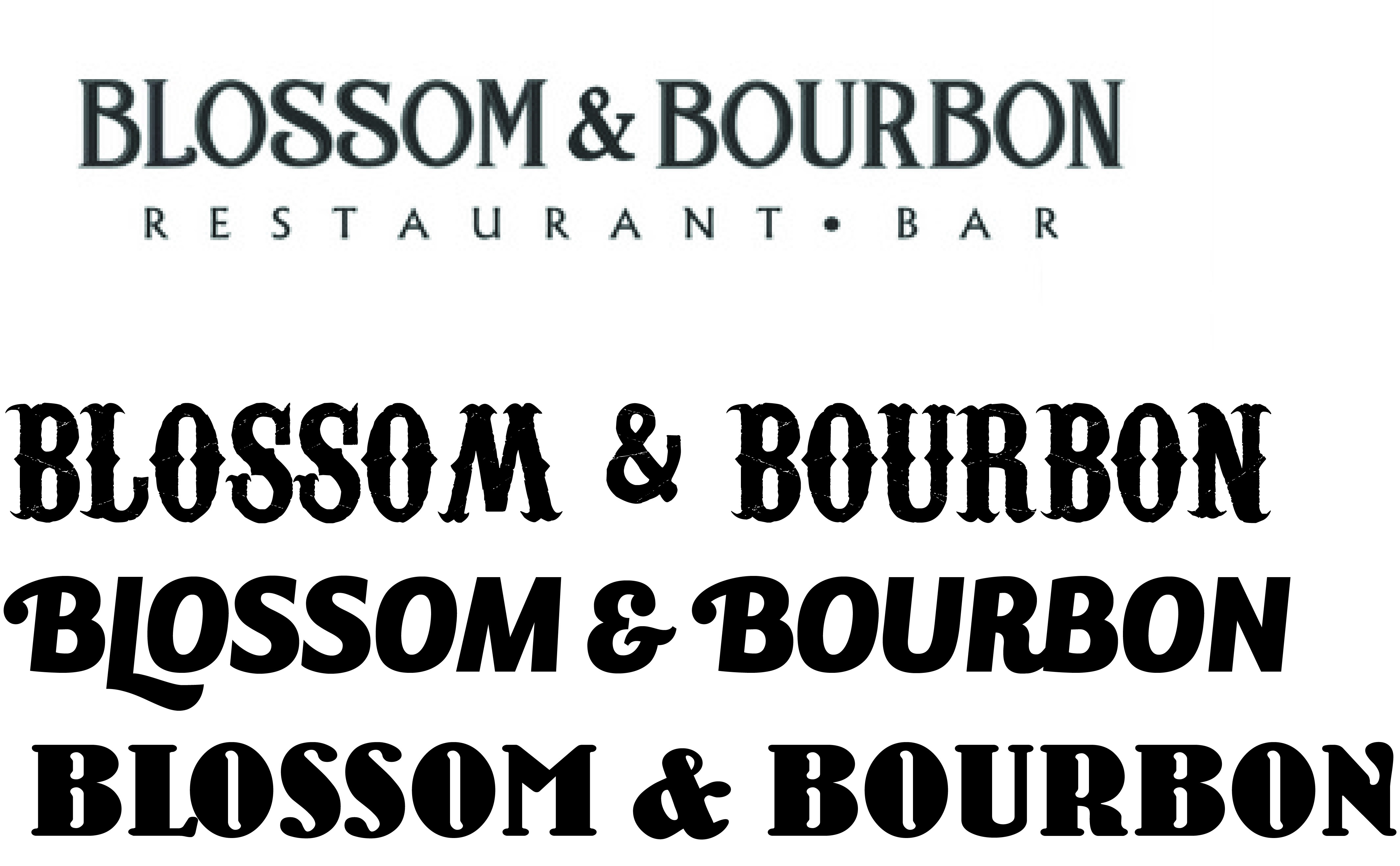
Most sign shops set a name in an existing typeface and call it a design. On this project, we worked alongside the owner to help shape the concept itself — exploring letterforms in every direction the name could go: saloon-western, flowing script, rounded and bold, refined serif. Then the chosen direction was modified letter by letter — widths, weights, the ampersand drawn to sit between the two B's — until the lettering belonged to this restaurant and no other.
Proofs went back and forth dozens of times. We never counted, because the count was never the point: the owner saying "that's it" was.
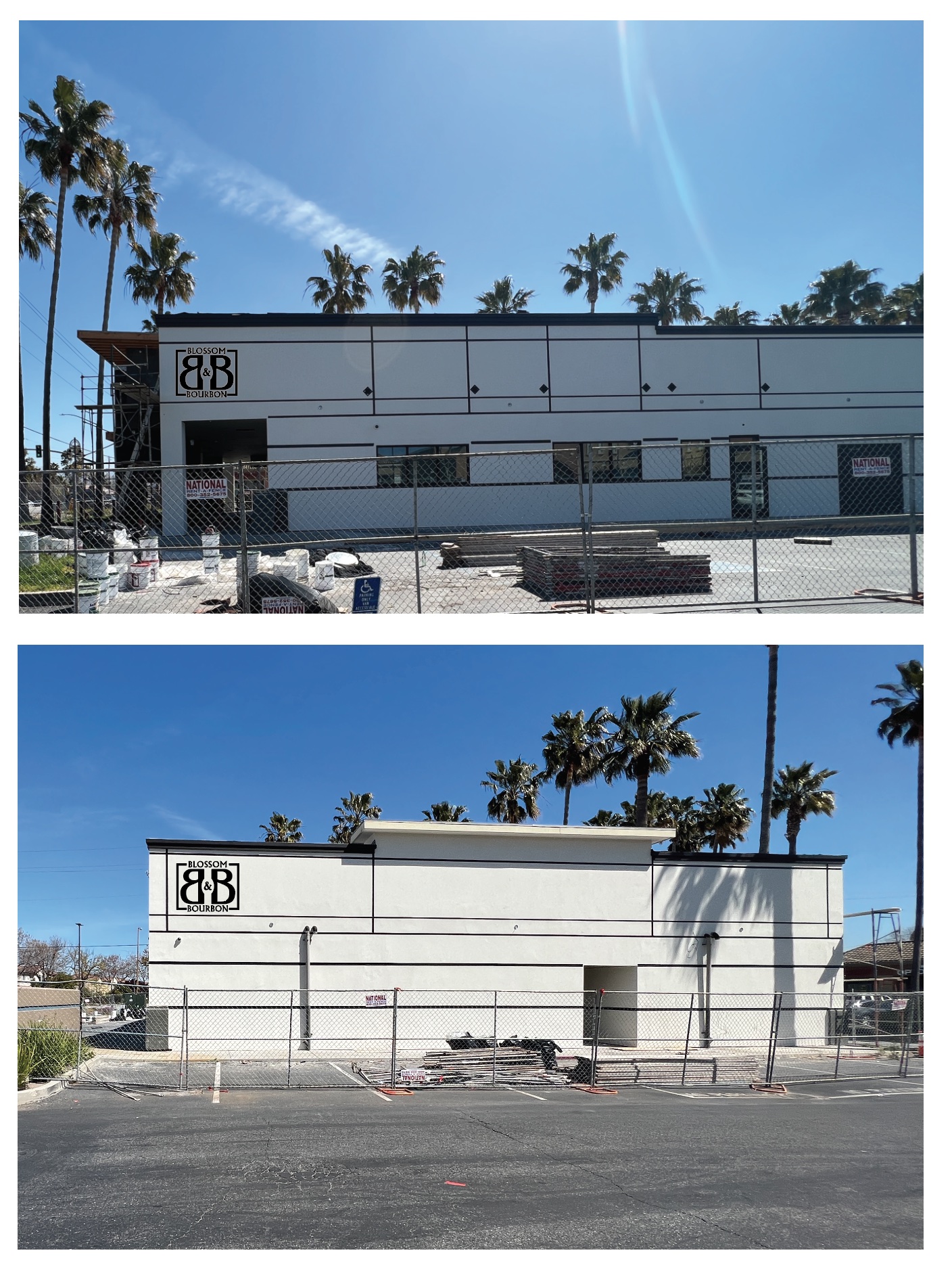
Front studies — backer panel, warm and cool
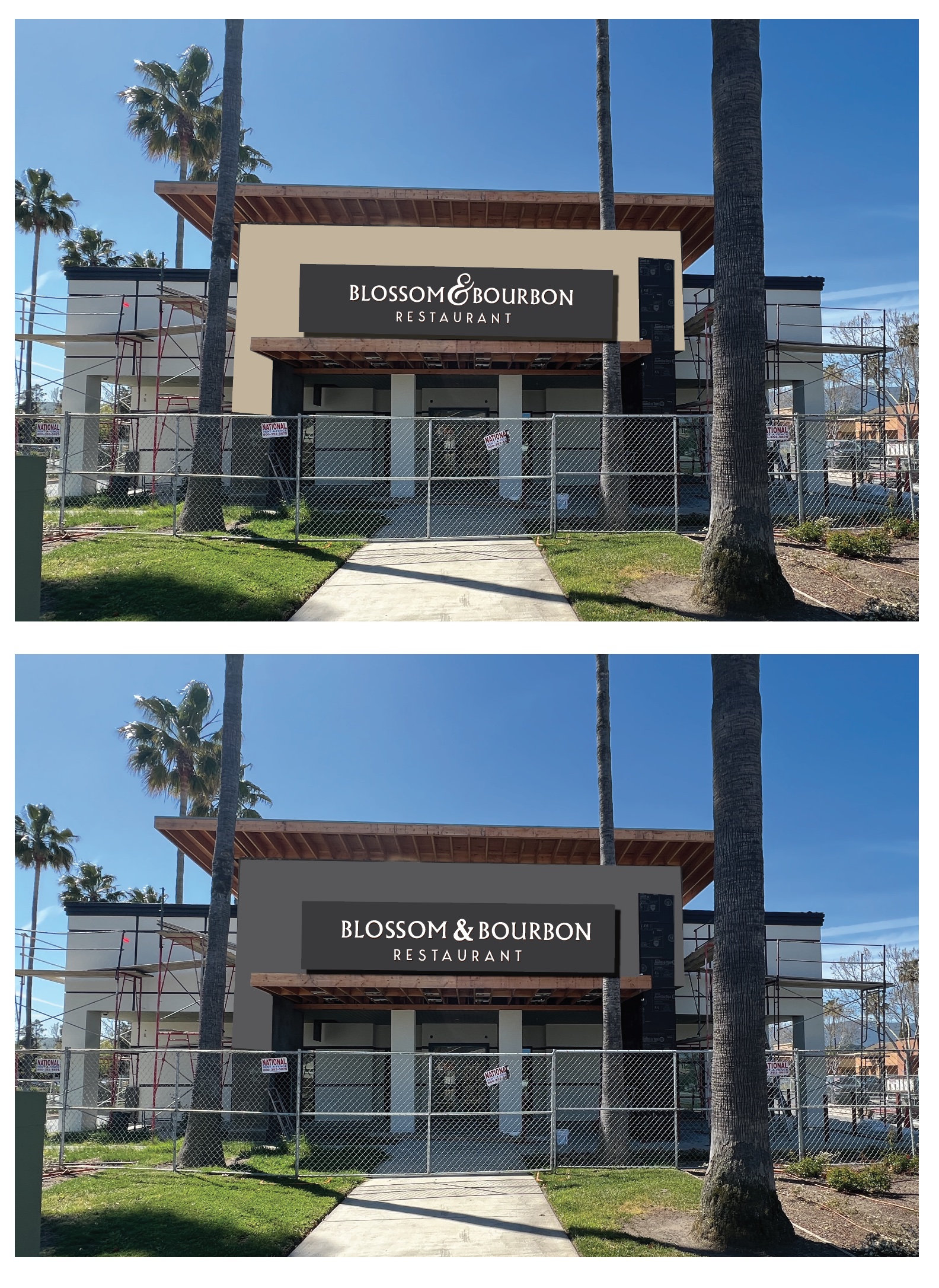
Front studies — color rounds, continued
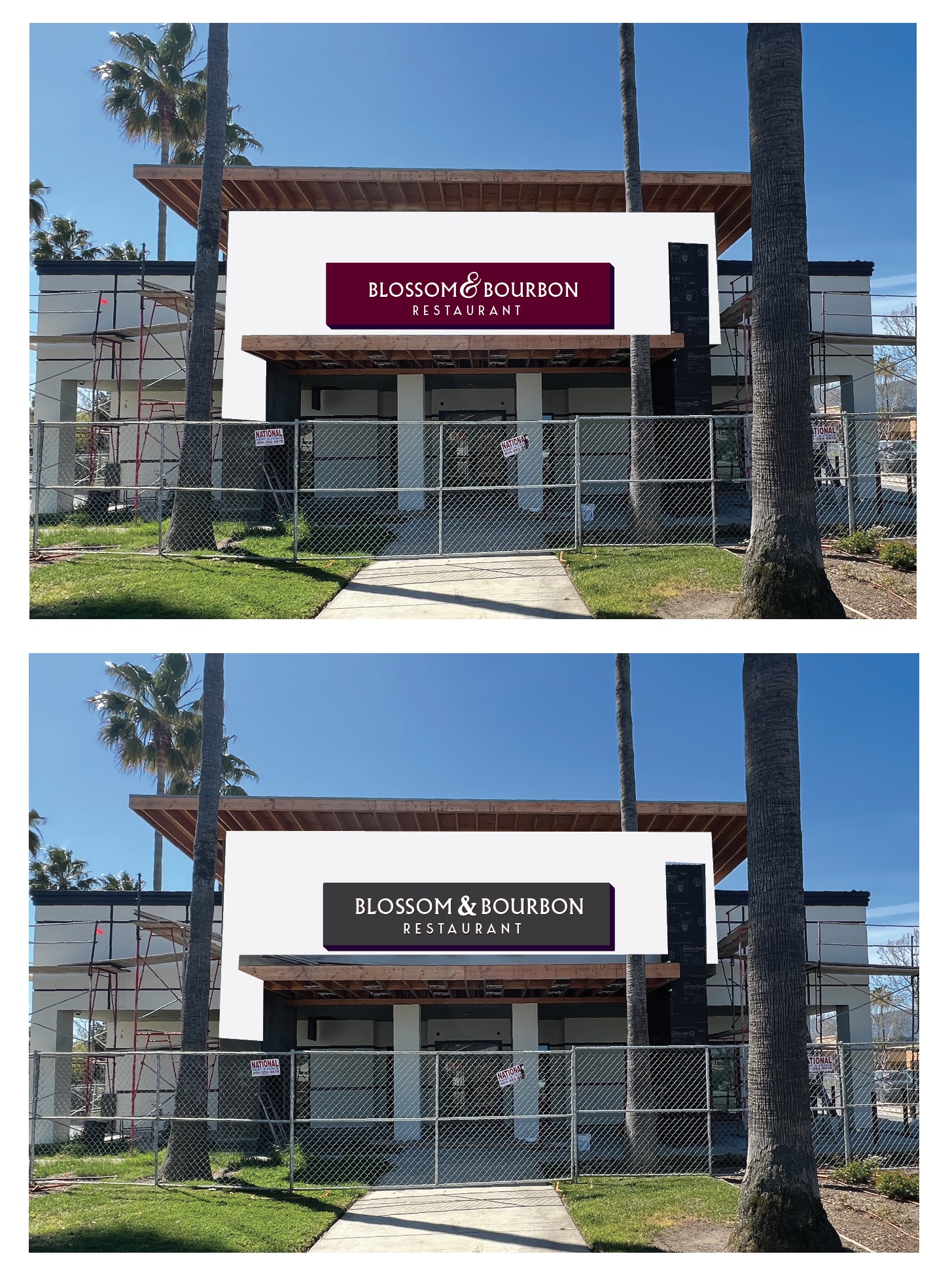
The early rounds wrapped the entry tower in a full backer panel — tan, gray, burgundy, charcoal, each one photographed onto the real building so the owner never had to imagine anything. Round by round, the design got quieter and more confident, until the backer fell away entirely: the letters would stand on the stone by themselves, and light would do the rest.
Chapter 3 — yours to keep
Then we handed the brand to its owner.
When the lettering was final, we did something many owners don't expect: we handed over the artwork. Every file, in every format — the owner's to put on menus, merchandise, aprons, anything — with no copyright held by us and no license fee down the road.
We build signs. The brand belongs to the owner. It seems obvious to us; ask around and you'll find it isn't.
The light logic
No box. No face light. Halo.
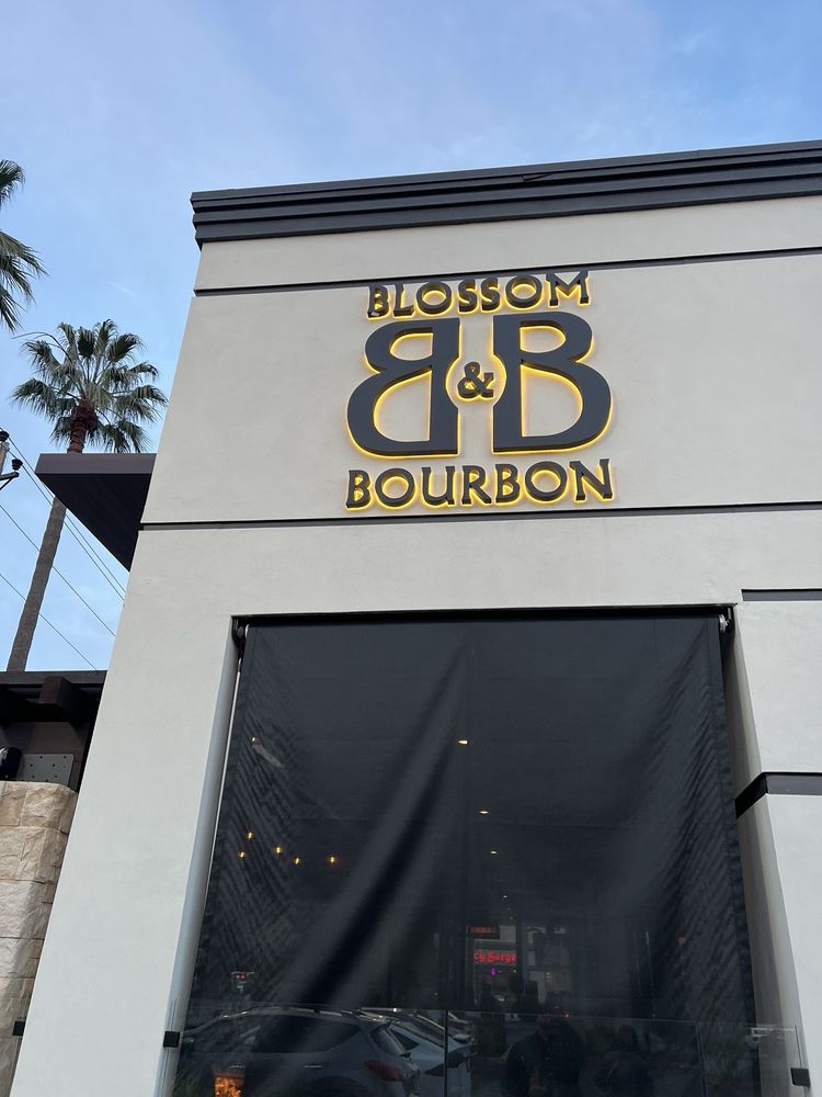
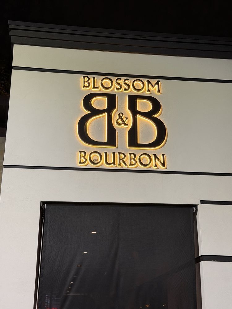
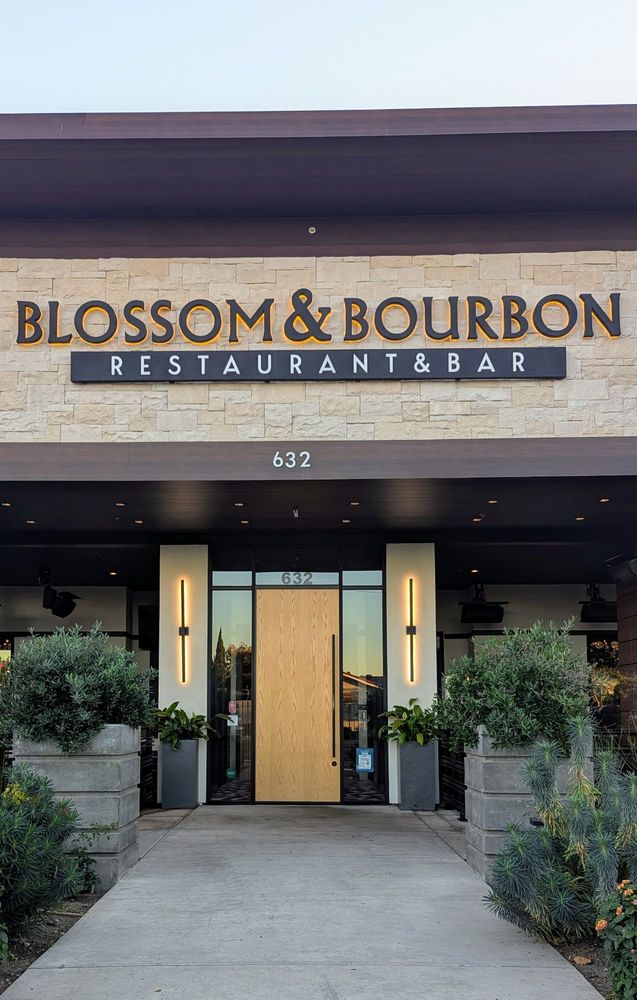
A restaurant sign works its hardest at dinner time, so the lighting was designed for dusk. We fabricated reverse-channel letters — metal faces, open backs — mounted off the wall, so the LEDs inside throw their light backward onto the surface behind. By day the letters read as crisp, dimensional architecture. At night each one floats in its own warm halo.
No plastic face glowing at you, no cabinet box around the name — just the lettering we drew together, written in light on stone.
Dusk — the side monogram, halo on
Night — the same wall, full glow
The result — 2024
One identity, from the street to the table.
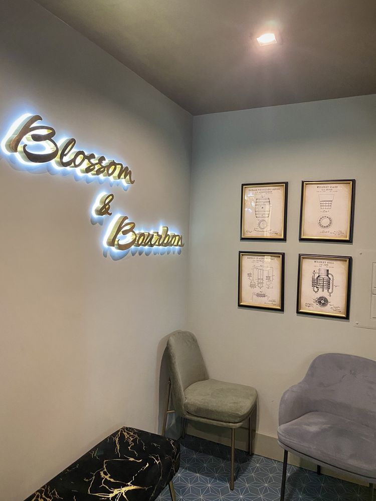
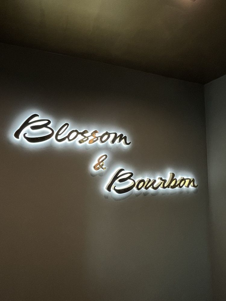
The full name runs across the stone of the main facade in halo-lit letters, with the restaurant & bar bar beneath it. The monogram holds the side elevation. Inside, the same identity continues in a flowing halo-lit script above the lounge — and on every printed menu on every table, which we produce as well, and have kept refining with the restaurant ever since.
Fabricated in our shop. Installed by our crew. One team from the first sketch to the first night the lights came on.
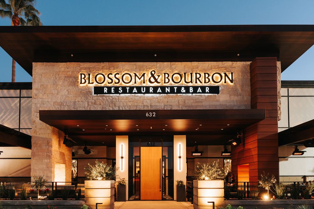
Daylight — letters as architecture
Interior — the script, halo-lit
The DT Signs standard
We don't just build the sign. We help build the brand — and then we hand it back.
Opening something new?
Come with a name. Leave with an identity — on your building, on your tables, and in your hands. We'll show you how we work the same way we showed this owner: proofs on your real wall, as many rounds as it takes, and every file yours when it's done.