Brand environment case study — Commercial One Insurance, Burlingame · interior + exterior
An insurance office, built like a working port.
Commercial One insures the trucking and shipping world, and they gave us one instruction: make the building feel like it. So the monument became a ship's bow, the elevators became a container terminal, the glass became a route map, and the doors became containers. Inside and out — designed, fabricated, and installed by DT Signs.
 DOORS CLOSED — A SHIPPING CONTAINER IN THE LOBBY
Chapter 1 — the brief
"Make it feel like trucking & shipping."
Commercial One Insurance Services works out of 411 Airport Blvd in Burlingame, and their specialty is the freight world — truckers, warehouses, logistics operators. They didn't want an office that could belong to any company with a logo swapped on the wall. They wanted their clients to walk in and feel their own industry looking back at them.
That was the whole brief. Not a sign package — a theme for an entire building, inside and out. We took it from concept to installed reality as one team.
Chapter 2 — the monument
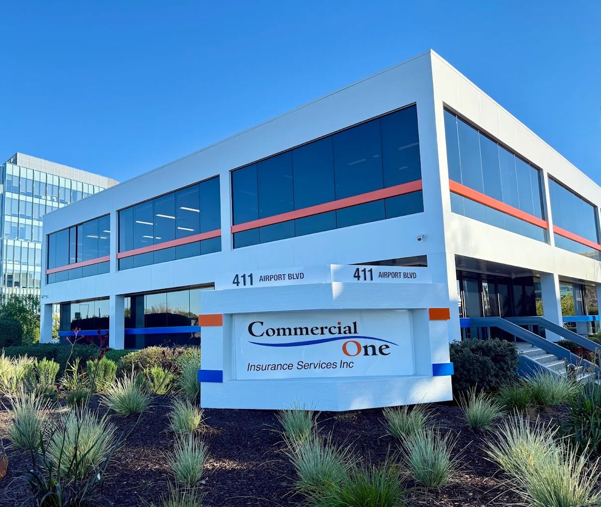
A ship's bow, moored on the front lawn.
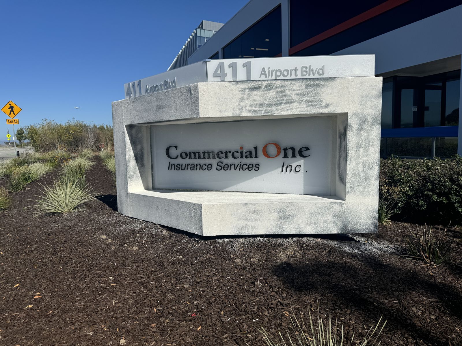
The street monument is where the theme starts. Instead of the usual rectangle on a base, we sculpted the form like the prow of a cargo vessel — an angled, dimensional shape that cuts toward the street, carrying the Commercial One name and the building address on its face. Custom-built in our shop, craned and set on site.
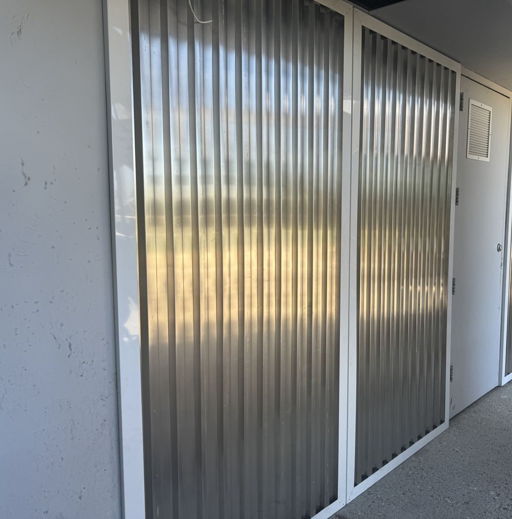
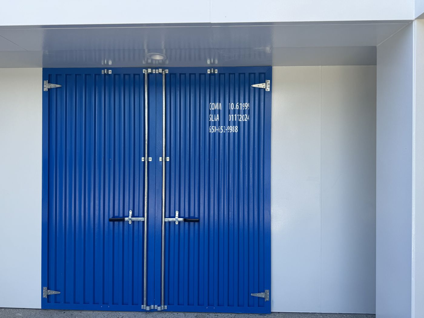
Around the building, service entries picked up the industrial language too — corrugated panels straight off a container yard.
The bow — monument, angled toward the street
Service side — corrugated container panels
Chapter 3 — the elevators
Press the button, step into the port.
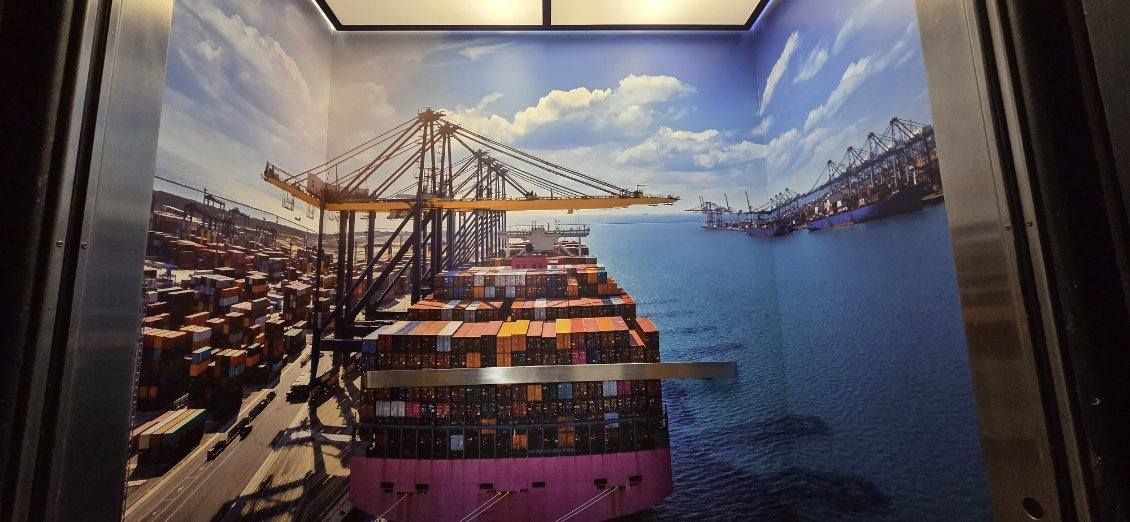
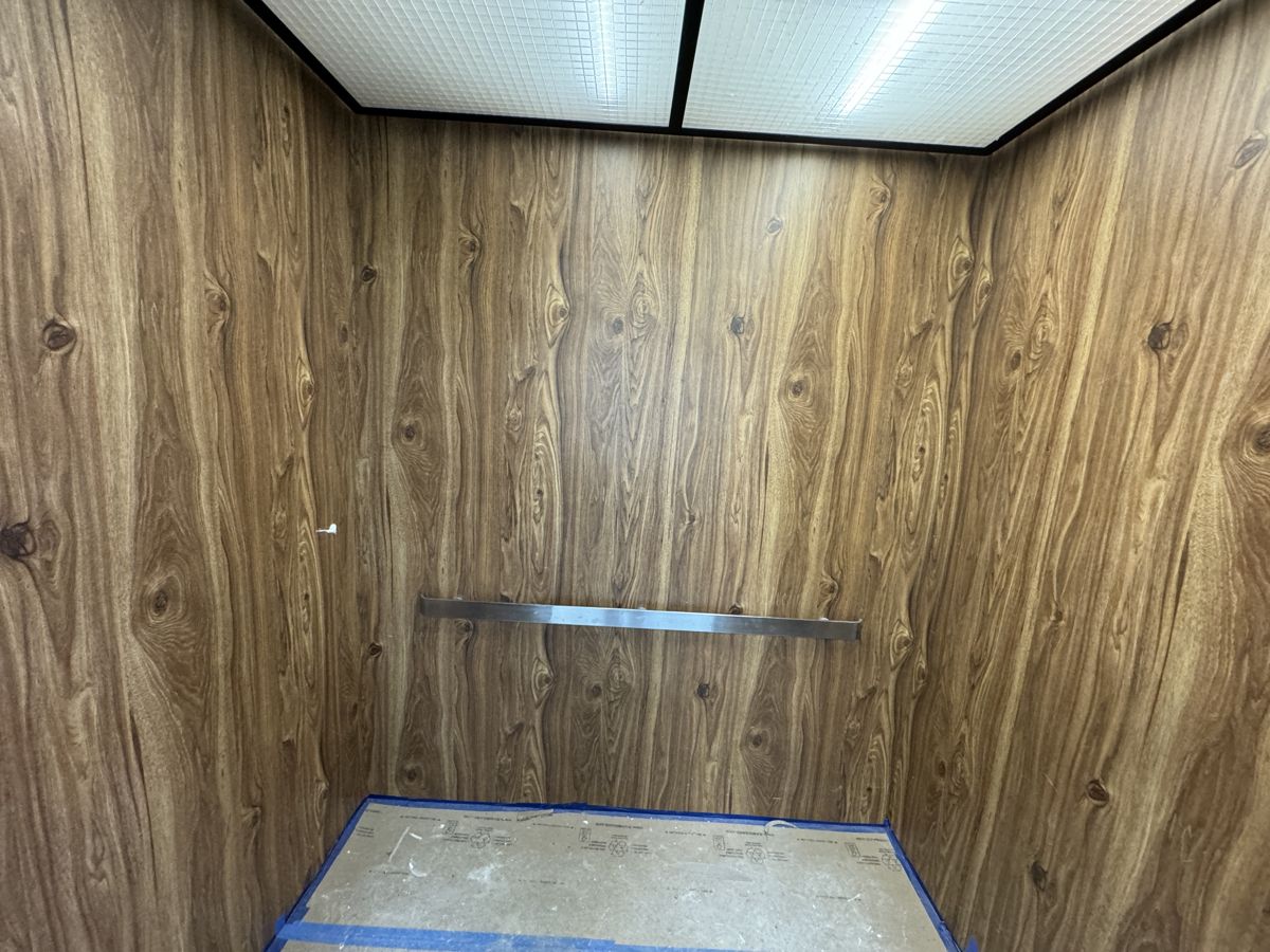
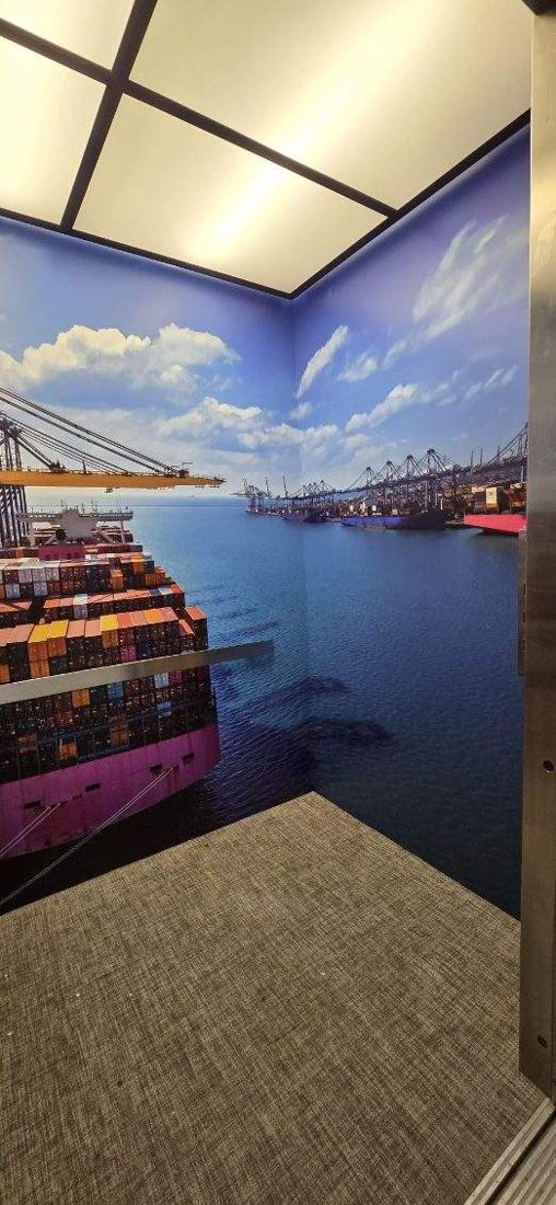
The elevators are the ride of the building — literally. Each cab is wrapped floor to ceiling as a working container terminal: gantry cranes overhead, a loaded ship at berth, stacked boxes running to the horizon. Riding between floors, you're standing on the dock.
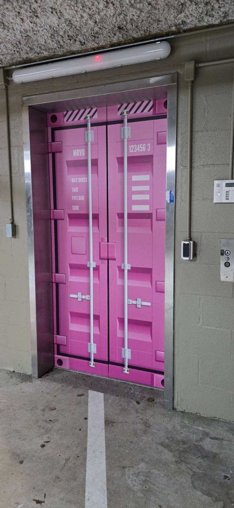
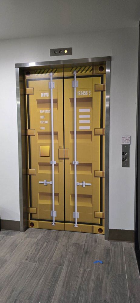
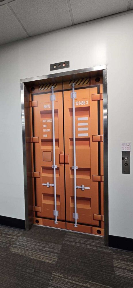
And on every landing, the elevator doors themselves are printed as full-scale shipping containers — hinges, lock rods, stenciled cargo markings — a different container color at each stop, so the doors double as wayfinding.
Landing 1 — pink
Landing 2 — yellow
Landing 3 — orange
Before — standard cab, wood laminate
After — the same cab, at berth
Chapter 4 — the office glass
A route map you can work inside.
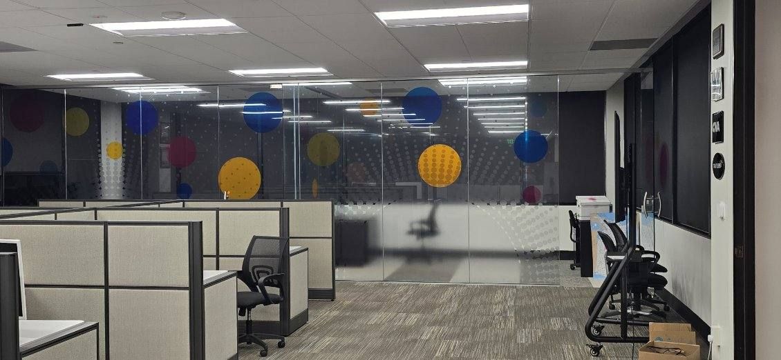
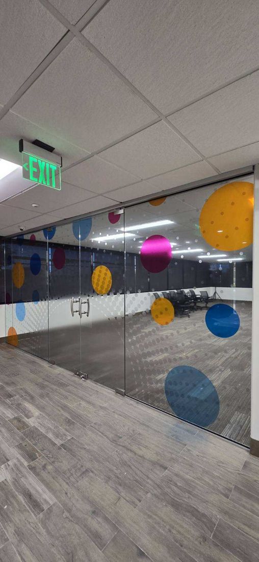
Across the office floors, the glass partitions carry a custom graphic system: a frosted band for privacy, overlaid with bold colored points — destinations marked on a chart, ports on a route. Conference rooms get their privacy; the floor keeps its light; and the shipping story keeps running through the workspace.
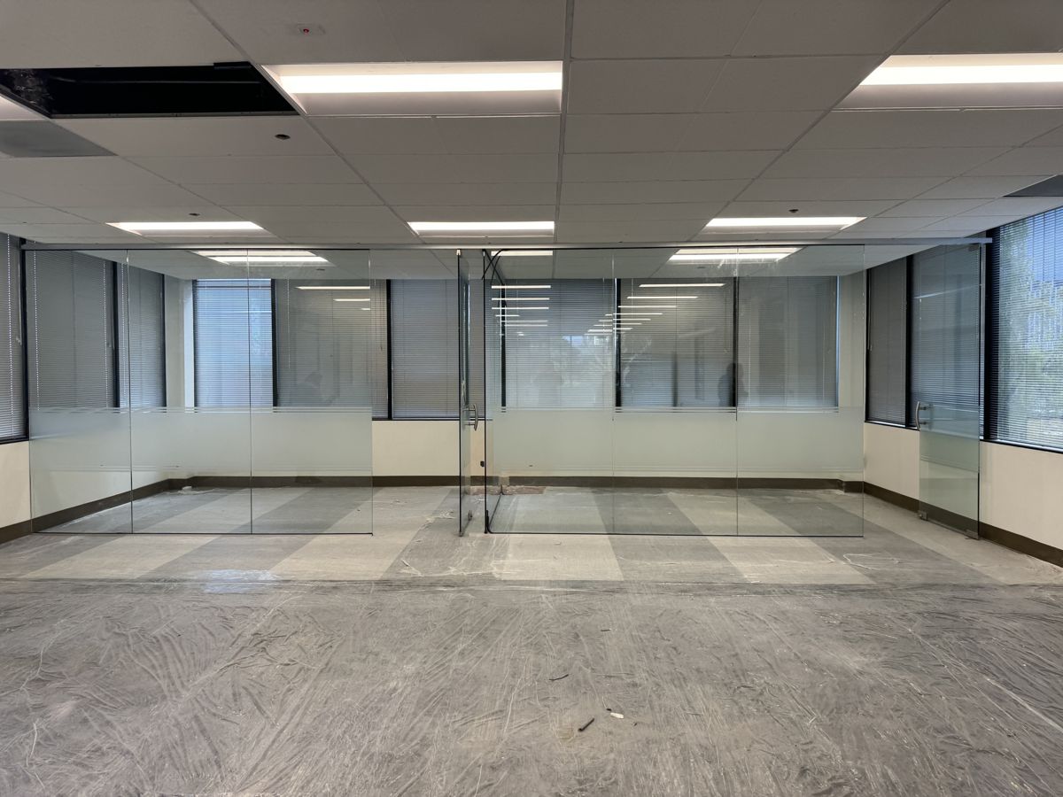
Before — bare glass, plain frost
After — the map, installed
Chapter 5 — the details
The theme runs to every last door.
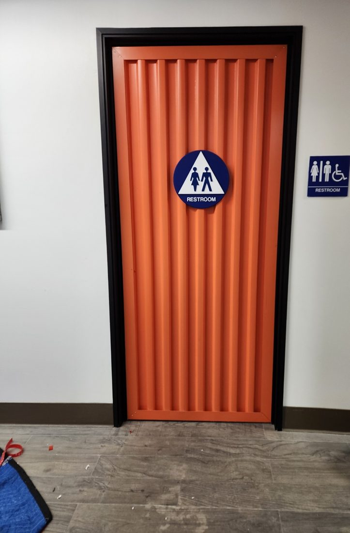
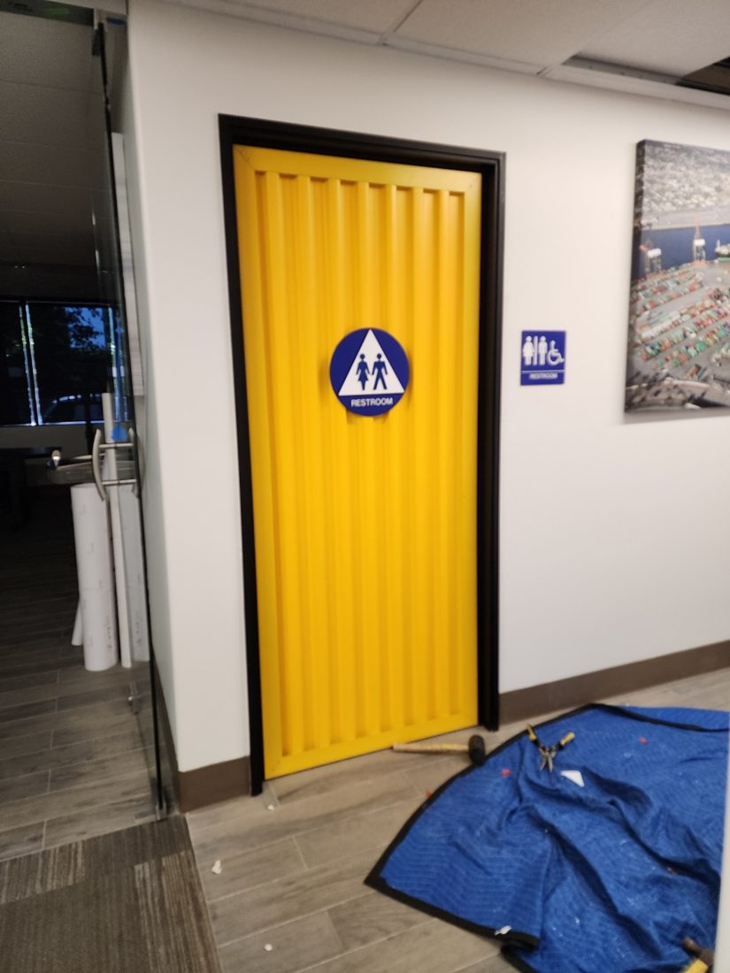
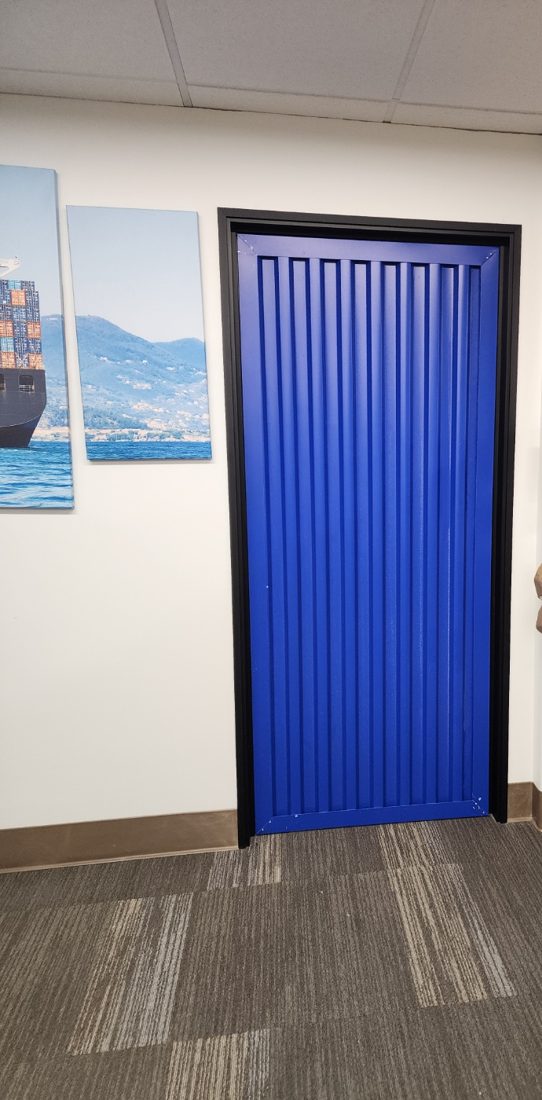
A theme only convinces when it holds up close. So even the restroom doors were rebuilt as containers — corrugated steel faces, fabricated in port colors, carrying the tri-sign and ADA plaques on the same palette, with ship and terminal murals running along the walls beside them. Outside, utility doors got the same treatment, stenciled with the client's own numbers.
Every piece — the bow, the wraps, the films, the doors — was designed, produced, and installed by DT Signs. One shop, one crew, one theme carried through.
Restroom — orange
Restroom — yellow, install day
Restroom — blue, murals alongside
The DT Signs standard
One client. One theme. Every surface — from the curb to the top floor.
Want your building to tell your story?
Bring us your industry, your brand, your building — we'll design the theme, proof it on your real walls, build it in our shop, and install every piece with our own crew. Monument to elevator, glass to door.